Typography Task 3: Type Design & Communication
10.06.2024 - 15.07.2024 (Week 8 - Week 13)
Kiew Ting Yi (Nicole) / 0361143 / Bachelor of Design (Honours) in Creative Media
Typography
Task 3 (Type Design & Communication)
  
Kiew Ting Yi (Nicole) / 0361143 / Bachelor of Design (Honours) in Creative Media
Typography
Task 3 (Type Design & Communication)
Table of Contents:
          1. Lectures
2. Instructions


        6. Further Reading
    
2. Instructions
                    4. Feedbacks
                  
                
                  5. Reflection
          
  LECTURES 
Refer to Task 1


Refer to Task 1
        INSTRUCTIONS


Task 3: Type Design & Communication


Task 3: Type Design & Communication
                    RESEARCH/REFERENCES


                        I always loved making fonts as a kid for their purpose
                        in delivering and expressing but I had no inspiration
                        somehow, so I wanted to find some online. Here was my
                        Pinterest search mood board and one of the inspired
                        ones:
                      
                      
                        I chose to search for 'round typography' because I was
                        particularly really fond of round fonts for their
                        robustness and uniqueness. But as I was sketching, I
                        felt like I needed to have some variety of shapes. These
                        were my sketches.
                      
                      
                        SKETCHES 


I added some empty "circles" to 't' and 'i' because I felt a little empty and wanted to be creative. I also made the punctuations to be hollowed inside as well. Mr Max suggested to just create accents like that for the entire typeface, and keep the strokes consistent. The hashtag was also commented to not be in italic because the whole font isn't. I revised, and here is the final sketch before the digitisation.


FINAL OUTCOME (POSTER)
                                  
                                    
Download Pimple Here! : PIMPLE FONT 2024


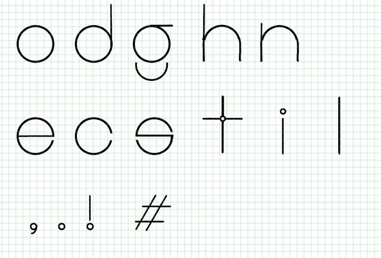
                            Initially we were given only 'o d g h n' to start,
                            and here are my 8 sketches done from Procreate.
                          
                          
                              Figure 1.2 8 Sketches with no Grids (Left) and
                                Figure 1.3 8 Sketches with Grids (Right)
                            
                            
                              Mr. Max chose number 4/5 to digitise, and I was
                              honestly really happy as I loved round fonts. So I
                              started sketching up the rest of the alphabets
                              given. In the beginning I really struggled with
                              the measurements, but after understanding the
                              Anatomy of Typography, it was getting easier to
                              sketch the rest of the letters. (o l e d s n c h t
                              i g . , ! #)


                                   | 
                                
| 
                                     Figure 1.4 No. 4 Sketch with o l e d s n c h t i g . , ! #  | 
                                
I added some empty "circles" to 't' and 'i' because I felt a little empty and wanted to be creative. I also made the punctuations to be hollowed inside as well. Mr Max suggested to just create accents like that for the entire typeface, and keep the strokes consistent. The hashtag was also commented to not be in italic because the whole font isn't. I revised, and here is the final sketch before the digitisation.
                            DIGITISATION


FONTLAB


Figure 2.0 Kerning and Side Bearing of the letters on FontLab
                          
                                We did a quick deconstruction of Bodoni Std's in
                                class, it was really fun but very hard to grasp
                                the round edges to ensure a smooth merge of all
                                the shapes formed from the guidelines.
                              
                              
                                  Figure 1.6 Deconstruction of letter 'm' and
                                    't' from Bembo Std
                                
                                
                                After understanding how one deconstructs, I
                                started to place my own font in, but I set my
                                x-height, cap height, baseline, ascenders, and
                                descenders.


                                     | 
                                  
| 
                                       Figure 1.7 'Pimple', by Kiew Ting Yi with Guides  | 
                                  
                                I didn't realised that these words were the only
                                ones we needed, but I think I had a good time
                                digitising my other letters to form some
                                sentences on FontLab that I made extra
                                letters:


                                       | 
                                    
| 
                                         Figure 1.8 Additional letters so I could write full sentences  | 
                                    
FONTLAB
                                  After digitisation, I moved on to copy and
                                  paste it into FontLab. It was good that Mr Max
                                  was strict with us during the sketches because
                                  after digitising, placing it to FontLab was
                                  quite smooth. Measuring and matching the
                                  x-height, cap height, baseline, ascenders, and
                                  descenders helped in making the process not as
                                  intimidating. 


                                       | 
                                    
| 
                                         Figure 0.0 all letters of (o l e d s n c h t i g . , ! #) with some extra letters and punctuations  | 
                                    
Figure 2.0 Kerning and Side Bearing of the letters on FontLab
                            Spacing of 'Pimple':
                          
                          - Ascender: 722pts
 - Cap Height: 638pts
 - X-height: 500pts
 - Baseline: 0pts
 - Descender: -189pts
 
                              Mr. Max reminded me to look at the notes while
                              adjusting the bearings, I found it very
                              interesting how the rules made it so much more
                              legible and well balanced to the end. After I got
                              the approval from him, I finalised my last poster
                              for my Font.
My Font's name is 'Pimple', because it somehow reminds me how the random but robust pimples that grows on your face, it's an eyesore sometimes but so hard to look away from.
                            
                                My Font's name is 'Pimple', because it somehow reminds me how the random but robust pimples that grows on your face, it's an eyesore sometimes but so hard to look away from.
FINAL OUTCOME (POSTER)
Download Pimple Here! : PIMPLE FONT 2024
                                    You can try typing with Pimple here:


FEEDBACK


REFLECTIONS


FURTHER READING
Type Anatomy Basics: Introduction to the fundamental components of type anatomy. X-Height: Definition and importance of x-height in type design. Ascenders and Descenders: Explanation of ascenders (parts of lowercase letters that extend above the x-height) and descenders (parts that extend below the baseline). Baseline: The invisible line on which characters sit. Cap Height: Height of capital letters from the baseline to the top of the uppercase letters. Counters: The enclosed or partially enclosed spaces within letters (e.g., in "a", "b", "d"). Serifs: The small lines or strokes regularly attached to the end of a larger stroke in a letter. Stems: The main vertical or diagonal strokes in letters (e.g., in "H", "L"). Bowls: The rounded forms that create an enclosed space (e.g., in "b", "o"). Spines: The main curved stroke of a letter (e.g., in "S"). Terminals: The end of a stroke that doesn't include a serif. Arms: Horizontal or upward sloping strokes that do not connect to a stroke or stem at one or both ends (e.g., in "T", "E"). Legs: Short, downward sloping strokes on a letter (e.g., in "K", "R"). Crossbars: The horizontal stroke in letters (e.g., in "A", "H"). Eyes: The enclosed space in the lowercase "e". Loops: The enclosed or partially enclosed lower counter in the double-story "g". Links: The connecting stroke between the bowl and loop of a double-story "g". Apertures: The partially enclosed, open spaces in letters (e.g., in "n", "c"). Understanding Proportions: How different elements like ascenders, descenders, and x-height affect type proportions and readability. 
                          FEEDBACK
                                          Week 8 (Independent Learning
                                            Week)
                                        
                                        
                                          General Feedback: Mr Max reminded us to post on
                                          Facebook Group and to submit on time
                                          :)
                                        
                                        
                                          Specific Feedback: Chosen the first digitisation, and
                                          third for final layout!
                                        
                                      
                                          Week 9 (Public Holiday)
                                        
                                        
                                            General Feedback:
                                            To sketch out and post on facebook
                                            and then be approved for
                                            digitisation.
                                          
                                          
                                            Specific Feedback: The letter 'h' needs to be in the
                                            same size as the 'o', and more
                                            construction needs to be done
                                          
                                          
                                              Week 10
                                            
                                          
                                            General Feedback: Sketching out with guidelines
                                            beforehand would be useful when
                                            deconstructing the sketch into a
                                            font.
                                          
                                          
                                              Specific Feedback: Need to post on Facebook asap
                                                to be approved for digitisation,
                                                but after chosen font, to sketch
                                                out the remaining letters.
                                            
                                      
                                            Week 11
                                          
                                          
                                            General Feedback:
                                            Setting the pts will help in FontLab
                                          
                                          
                                            Specific Feedback: Added accents to the font to
                                            be more interesting, digitised.
                                          
                                          
                                              Week 12 (Absent)
                                            
                                              General Feedback:
                                            
                                            
                                              Specific Feedback: 
                                            
                                          
                                              Week 13
                                            
                                          
                                            General Feedback: Everything should be done today,
                                            and then compile it for Week 14
                                          
                                          
                                              Specific Feedback: Be very cautious of side bearings and kerning as it helps the font to be more legible
                                          REFLECTIONS
                                                Experience
                                              
                                            This assignment really made me felt many different roller coaster emotions, from the start of ideating towards posting this on the blog. I experienced the full design process, from initial concept to final execution, including sketching, digitizing, and refining my font. I also gained hands-on experience with font design software such as FontLab, which prior I have never heard of. I had to go through multiple iterations, learning the importance of refining and testing each character for consistency and readability, making this assignment a true challenge.
                                                Observation
                                              
                                            I observed that designing a font requires meticulous attention to detail. Small changes in stroke width, curvature, and spacing can significantly impact the overall look and feel of the font.
For characterisation, I noticed the challenge of maintaining consistency across all characters. Ensuring that each letter harmonizes with the others in terms of style and proportion is crucial. I also realized the importance of readability. A font must be legible at various sizes and in different contexts, which influenced my design choices.
                                              Findings
                                            
                                            Throughout this assignment, I found that a deep understanding of typography principles, such as x-height, ascenders, descenders, and kerning, is essential in font design. I discovered that creating a font is a form of creative expression, allowing me to convey a specific mood or style through type. I definitely developed some technical skills in using design software and understanding font file formats and their applications. I also learned the value of feedback. Sharing my font with peers and instructors provided valuable insights, helping me to improve and refine my design. I hope to continue this practice in becoming a well sufficient designer.
FURTHER READING
Overall, learning this has definitely helped my kernings and for me to understand the anatomy of typography more.


