Advanced Typography Task 1: Exercises (1 & 2)
24.10.2024 - 15.10.2024 (Week 1 - Week 4)
Kiew Ting Yi (Nicole) / 0361143 / Bachelor of Design (Honours) in Creative MediaAdvanced Typography
Task 1 : Exercises 1 & 2 (Typographic Systems, Type & Play)
Table of Contents:
1. Lectures
2. Instructions
2. Instructions
3. Task 1: Exercise 1
& 2
- Exercise 1: Typographic Systems
- Exercise 2: Type & Play
LECTURES
Lecture Playlist: https://www.youtube.com/playlist?list=PLZk01iRkmnlWiFq7epH05A-lMt_bHmGQk
Week 1
Week 3
TASK 1 - EXERCISE WEEK 1 & 2 (20%)
Deadline: Week 4
Using the words given, choose a headline along with the content, come up with 8 typographic systems ( 200 mm x 200 mm, 300dpi) using Adobe Illustrator:
3 Headlines to choose:
- All Ripped Up: Punk Influences on Design
- The ABCs of Bauhaus Design Theory
- Russian Constructivism and Graphic Design
Include the following content as well:
The Design School, Taylor's University
Open Public Lectures:
Lecture Theatre 12
June 24, 2021
Lew Pik Svonn, 9AM-10AM
Ezrena Mohd., 10AM-11AM
Suzy Sulaiman, 11AM-12PM
June 25, 2021
Lim Whay Yin, 9AM-10AM
Fahmi Reza, 10AM-11AM
Manish Acharia, 11AM-12PM
Element graphics can be used but only to enhance and support the exploration or ideas of the typographic system.
8 Types of Typographic Systems
1. Axial
Elements are aligned to either side of a single central axis.
2. Radial
Elements radiate outward from a central point.
3. Dilatational
Elements expand outward in circular patterns from a central point.
4. Random
Elements are arranged without a defined order or structure.
5. Grid
Elements are structured within a matrix of vertical and horizontal
lines.
6. Modular
Elements are organized as consistent, standardized units.
7. Transitional
Elements flow in a layered, band-like manner without strict formalism.
8. Bilateral
Elements are symmetrically arranged along a single axis.
Week 2
Week 2
Rule of Thirds: A compositional guide where a frame is
divided into three columns and rows, with the intersection points used
to position key elements for balance. While useful, it's often set aside
in favor of other techniques.
Environmental Grid: A system created by analyzing and
extracting key lines from one or more structures, both curved and
straight, to guide design.
Form and Movement: Builds on the Grid System, where the
positioning of forms across multiple pages creates a sense of movement,
whether in print or on screens.
Week 3
Cuneiform, the earliest writing system, featured wedge-shaped
marks made by pressing a reed stylus into clay.
Hieroglyphics combined rebus and phonetic symbols, functioning
as ideograms (representing depicted objects), phonograms (representing
sounds), and determinatives (clarifying the meaning of preceding
symbols).
The Phoenicians' phonetic alphabet, based on the Egyptian
system, influenced later Greek and Roman scripts, which evolved in
style over time. Roman Uncials became more rounded, leading to English
Half Uncials. Later scripts like Carolingian Minuscule, Black Letter,
and Renaissance letterforms shaped European writing.
In India, the Brahmi script and its derivatives influenced
Southeast Asian writing systems.
Week 4
Week 4
Frutiger is a sans serif typeface designed for legibility in
low-light or fast-moving situations.
Verdana was created with pixel-based characteristics, rather
than traditional tools like pens or chisels.
Underground combines classical Roman proportions with a
humanist touch.
Type Design Process:
1. Research: Study type history, anatomy, and its intended
use.
2. Sketching: Initial designs using traditional or digital
tools.
3. Digitization: Using professional software to refine type.
4. Testing: Ensures readability and legibility.
5. Deploy: Revision continues even after release.
Typeface Construction: Grids, particularly with circular
forms, are used to design letterforms.
INSTRUCTIONS
<iframe allow="autoplay" height="480" src="https://drive.google.com/file/d/10GrEmGJywcV9HMAGKbcNw5yjp6eSNuiO/preview" width="640"></iframe>
Module Information Booklet
TASK 1 - EXERCISE WEEK 1 & 2 (20%)
Deadline: Week 4
EXERCISE 1: TYPOGRAPHIC SYSTEM
Using the words given, choose a headline along with the content, come up with 8 typographic systems ( 200 mm x 200 mm, 300dpi) using Adobe Illustrator:
3 Headlines to choose:
- All Ripped Up: Punk Influences on Design
- The ABCs of Bauhaus Design Theory
- Russian Constructivism and Graphic Design
Include the following content as well:
The Design School, Taylor's University
Open Public Lectures:
Lecture Theatre 12
June 24, 2021
Lew Pik Svonn, 9AM-10AM
Ezrena Mohd., 10AM-11AM
Suzy Sulaiman, 11AM-12PM
June 25, 2021
Lim Whay Yin, 9AM-10AM
Fahmi Reza, 10AM-11AM
Manish Acharia, 11AM-12PM
Element graphics can be used but only to enhance and support the exploration or ideas of the typographic system.
PROCESS


Figure 1.4 Random System

Figure 1.5 Grid System

Figure 1.6 Modular System


Figure 1.8 Bilateral System
Mr Vinod immediately pointed out the ones that are way off
the mark, such as my Radial, Random and Bilateral;
meanwhile the rest either needed some modification or
it was okay. I quickly fixed the ones that are incorrect,
and kept the ones that are okay. I might find myself
improving this task and exercise in the future, but for now
I am content with the current state of this exercise.


Figure 2.7.1 Final Outcome PDF Without Grid, Week 2
FINAL OUTCOME WITH GRID
I started by coming up with things that I could extract from
the book. However, due to my lack of exploration, I came up
with "safe" designs, and some of them were way out of the
mark. Here's my first set of 8 Typographic Systems:

|
|
Figure 1.0 Compiled versions of first draft |
Figure 1.1 First draft in pdf

Figure 1.1 Axial System

Figure 1.2 Radial System

Figure 1.3 Dilatational System

Figure 1.4 Random System

Figure 1.5 Grid System

Figure 1.6 Modular System

Figure 1.7 Transitional System

Figure 1.8 Bilateral System
FIXED/FINAL RESULT

Figure 1.9 Axial System (Final)

Figure 2.0 Radial System (Final)

Figure 2.1 Dilatational System (Final)

Figure 2.2 Random System (Final)

Figure 2.3 Grid System (Final)

Figure 2.4 Modular System (Final)

Figure 2.5 Transitional System (Final)

Figure 2.6 Bilateral System (Final)
FINAL OUTCOME PDF WITHOUT GRID
Figure 2.7.1 Final Outcome PDF Without Grid, Week 2
FINAL OUTCOME WITH GRID
Figure 2.7.2 Final Outcome PDF With Grid, Week 2
EXERCISE 2: TYPE & PLAY

Figure 2.17 Fugal Poster in PDF
Extract letters from manmade object images (chair, glass, etc) or structures
(buildings), or something in nature (human, landscape, leaf, plant, bush,
clouds, etc) and ensure that the image does not contain many different
elements. After extracting minimum 5 letters from the image, the task
requires you to refer to a similar font while maintaining it's texture or
pattern of the image, and create a poster
(1024px x 1024px, 300dpi) with elements that is in harmony of the
extracted and modified letters.


Figure 2.11 Extractions and Reiterations in PDF


PROCESS
The way I've decided to approach this assignment is to think about what
are some things I would like to extract to become a typeface I could use
in the future. I thought of plants, but I find that most of the examples
Mr Vinod shown were plant based, so I pivoted my thinking and realised-
I can make letter from my thinking - the brain.


|
| Figure 2.8 Brain picture I found on Pinterest , Week 3 |
I noticed a few letters already spoke to me in the picture. Here's
what I found:

|
|
Figure 2.9 Extracting Letter using Neon Green color as a marker, Week 3 |

Figure 2.10.1 Overall Process, Week 3

Figure 2.10.2 Original Extractions, Week 3

Figure 2.10.1 Reference Font, Arial Rounded MT Bold, Week 3

Figure 2.10.1 First Reiteration, Week 3

Figure 2.10.1 Second Reiteration, Week 3

Figure 2.10.1 Third Reiteration, Week 3

Figure 2.10.1 Final Reiteration, Week 3
Figure 2.11 Extractions and Reiterations in PDF
POSTER MAKING
For the poster, I started by arranging the brain pictures in a pattern. I used Adobe Photoshop for this, got rid of the background and made a clipping mask, then duplicated and reordered them.
For the poster, I started by arranging the brain pictures in a pattern. I used Adobe Photoshop for this, got rid of the background and made a clipping mask, then duplicated and reordered them.

Figure 2.12 Pattern made from the brain picture.
As the word "FUGAL" comes from a version of the word "FUGUE", which had
meanings related to one's loss of awareness, according to Google.

|
|
Figure 2.13 Fugue Definition from Google It made more sense to me that this is a brainy movie, and that I should be mindful* about the way I place the words. *(Pun was very, and highly intended.) |
I wanted it to be black and white, so I set the rest to be monochromatic,
and playing with values. I also added a halftone effect because I love how
unserious it gives.

Figure 2.14 Using Smart Filters, Setting Background, Halftone Layer and
Effects on the Fugal Word.

Figure 2.15 Adding stroke to the "FUGAL" words minimally
FINAL POSTER OUTCOME

Figure 2.16 Fugal Poster, 1024px x 1024px, 300dpi
FEEDBACKS
Week 1
General Feedback: Mid section of e-portfolio should be off-white to showcase the pictures more
Specific Feedback: Take the opportunity of the time frame to explore more before deciding on the Task 3 choice.
Week 2
General Feedback: Remember the terms "Form follows function", in order to create a more effective design and not just "aesthetics"
Specific Feedback: Axial, radial, random, bilateral need to be reconstructed- modular & grid is interesting but needs more modification, transitional should break more lines to have more effective design
Week 3 (Absent with Leave Approved)
General Feedback: Make sure the strokes are consistent.
Specific Feedback: Try not to use crevices to extract the letter, rather take the letter as a whole.
Week 4 (Absent with Leave Approved)
General Feedback:
Specific Feedback:
REFLECTIONS
EXPERIENCES
From this assignment, I experienced the consequences of not exploring enough or using my time "judiciously" as Mr Vinod put it, it's clear as night and day that this assignment was not to my expectations or demonstrates my ability as a typographer. But just as any experience, I am given the grace of time and I hope I will be better moving forward.
OBSERVATION
I saw that understanding visually on typographic systems are not enough, a lot of it has to do with constant exploration or doodling/sketching for inspirations to come. I forgot my design process and in this assignment I am glad to rekindle that desire to have a proper process before continuing. I really liked that I had a concept before placing my thoughts in Task 2. I hope that I could do more of that in the assignments to come.
FINDINGS
I find that I have a hard time doing random typographic system due to my sensitivity towards structure and grid. I think somewhere in my brain there's an Editor-In-Chief (or at least try to be) that prefers Grid/Modular structure for visual layouts always and it was quite annoying to pipe it down doing this assignment. I also think I really need a new pair of eyes so that I don't become desensitised over everything.
FURTHER READING

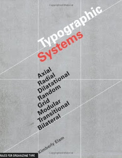
Figure 3.0 Typographic Systems by Kimberly Elam, Week 4
Kimberly Elam's Typographic Systems explores eight different systems for organizing type and design elements. Each system provides a structural framework for arranging content, allowing designers to create visually engaging and meaningful layouts. The book emphasizes that while these systems are distinct, they often overlap and can be used together to achieve balance, movement, or tension within a design.
Axial System: In the axial system, all elements are organized around a central axis, either vertical or diagonal. This method creates a sense of order and flow, guiding the viewer’s eyes along the axis while maintaining a clean, structured design. It’s effective for minimalist layouts and can be used to create a clear hierarchy.
Radial System: In the radial system, elements radiate from a central point. This system is dynamic, pulling attention toward the center of the composition and creating movement that feels organic. It’s useful for designs that emphasize a central focal point, such as logos or certain types of graphic posters.
Dilatational System: The dilatational system organizes elements in circular paths, expanding outward from a central point. This creates a rhythm that mimics the flow of water ripples or sound waves. Dilatational layouts can be visually striking, ideal for creating an engaging, layered feel while maintaining readability.
Random System: As the name suggests, the random system appears to have no specific pattern. However, this intentional disorder allows for creative freedom, giving the layout a chaotic yet controlled aesthetic. It works well in experimental designs where a break from convention is desired.
Grid System: The grid system is one of the most widely used methods, where vertical and horizontal lines form a framework that provides clear structure. It’s highly adaptable, making it ideal for layouts where alignment, consistency, and a sense of order are paramount, such as in books, magazines, or websites.
Modular System: The modular system involves using fixed, standardized units or modules to structure content. These modules are repeated and arranged to form a cohesive design. It’s particularly effective in systems that require flexibility, such as posters or product packaging, where information must be easily interchangeable.
Transitional System: The transitional system features layered bands of information that create a sense of movement and flow. This system is less rigid than the grid and allows for more organic transitions between elements. It’s great for designs where movement or progression is a key theme.
Bilateral System: In the bilateral system, elements are symmetrically arranged on either side of a central axis. This system emphasizes balance and symmetry, making it ideal for formal or classic designs. It’s often used in invitations or documents where a refined, professional appearance is needed.
Elam’s exploration of these typographic systems encourages designers to experiment with different ways of structuring their layouts, understanding that each system can influence the tone, legibility, and emotional impact of a design. By mastering these systems, designers can create more intentional and effective compositions that resonate with their audience. Typographic Systems is both a practical guide and a creative resource for anyone looking to deepen their understanding of layout design.
